Last week, I’ve lost all content in this topic since I’ve upgraded wordpress to newest version: v2.8.3. The problem happened since wordpress v2.8, ’cause the error to save the content in the visual mode then it disappear after done. Therefore the publication of this article were prolonged than scheduled.
Most would probably agree that CSS is one of the most important parts of modern standards based web design. CSS is really simple and extremely powerful if you know how to master it… if your new to CSS getting started can be quite hard. I hope this article will help you all to get more out of CSS in your web projects.
CSS Blank Layouts
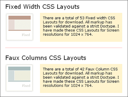
- Code-Suck CSS Layouts- There are a total of 42 faux-column and 53 fixed-width CSS layouts for downloading. All markup has been validated against a strict Doctype.
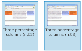
Code-Suck CSS Layouts - CSSPlay CSS Layouts – Stu Nicholls – Three columns, CSS frame, “Fixed”, Cross browser….
- ___layouts – The foundational ___layouts file offers five preset page widths, the option to have a fixed width or a text “zoom”-style scaling effect and two core templates that give you the ability to nest subdivided regions of one to four columns. The framework supports fluid-width layouts and fixed-width layouts.
- Layout Gala- In November 2005 He presented on pro.html.it a three-part article on creating CSS layouts using techniques like negative margins, any order columns and in some case opposite floats. The main goal of the article was getting the maximum number of layouts based on the same markup, each with valid CSS and HTML, without hacks nor workaround and a good cross-browser compatibility. The result is a set of 40 layouts that they’ve thought worth sharing: on each of them you’ll find also a download link (if you want, you can download the entire collection, 40 HTML pages in a single zip file). Further details can be found below the gallery.
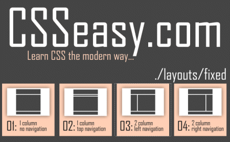
Layout Gala - CSSEasy– CSS Easy is a great site if you are learning CSS or just would like to copy and paste some script, But it’s more fun learning and doing it yourself then copy and paste
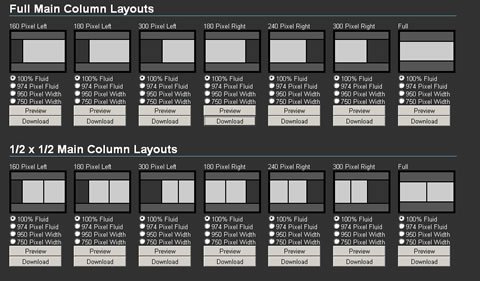
CSSEasy - MaxDesign Sample CSS Layout – Here are a range of CSS page layouts, including 2 column and 3 column layouts – free to use and abuse as needed.
- IronMyers CSS Layouts– These CSS Layouts offer full Grade-A browser support. That means that these CSS Layouts will look and behave the same in all internet browsers, like Internet Explores 6 (IE6), Internet Explorer 7 (IE7), Firefox, Opera, Safari and so on. Since Search Engine Optimization (SEO) is very important to websites, these CSS Layouts have been optimized to give you the best possible search engine results. Use these CSS Layouts anywhere you wish. They are perfect for Website templates, Blog themes, Content Management Systems (CMS) or as a starting point for your Web projects. Use these CSS Layouts to optimize your Web Development workflow. These CSS Layouts are done in Pure CSS, not tables.
IronMyers layouts - ThreeColumnLayouts – The question of finding good 3 column layouts comes up in the mail list from time to time. Here are some that I have found, along with a few notations about what features they include and how they work. The judgment of “good” is left to you and your needs. Each offers interesting techniques for the CSS student. By the way, when visiting these places, look around; many of these people offer other layouts that I have not included here.
CSS Grid Design
Sure, if you use grids, you’ll have to add some necessary HTML tag markup to your content, thus increasing page file sizes. Also, this means that markup and style are not truly separated – a tenet which many web designers would like to adhere to. (Some people feel, rightly or wrongly, that naysayers of CSS frameworks are designers who are worried that the need for their services will decline. Though, with this logic, coders are in trouble, too, especially with the increase in cross-browser code libraries such as jQuery.)
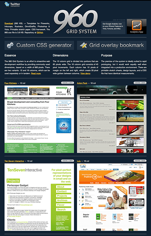
- 960 Grid System– The 960 Grid System is an effort to streamline web development workflow by providing commonly used dimensions, based on a width of 960 pixels. There are two variants: 12 and 16 columns, which can be used separately or in tandem.
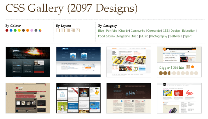
960 Grid System - DesignShack Grid CSS Gallery
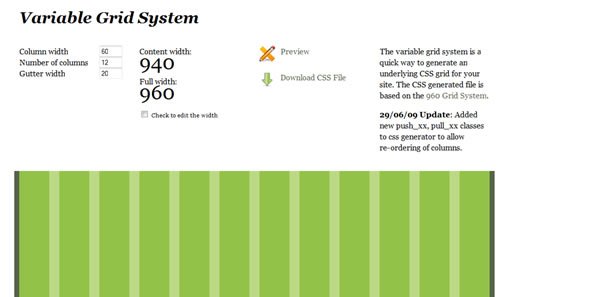
DesignShack Grid CSS Gallery - Variable Grid System- The variable grid system is a quick way to generate an underlying CSS grid for your site. The CSS generated file is based on the 960 Grid System.
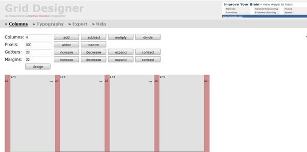
Variable Grid System - Grid Designer– If you’re familiar with the grid, a bit of design and basic typography, using this script should be pretty easy – most of the functions are pretty self-explanatory.
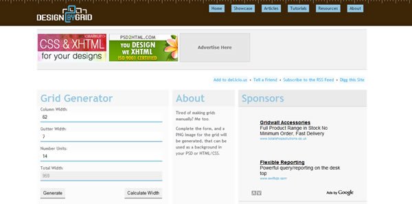
Grid Designer - Design By Grid PNG Grid Generator– Grid based design for websites is becoming more popular, but the technique is still somewhat unknown.Design By Grid is a resource to promote websites designed with grids, and the tools and techniques used to make websites with grids.
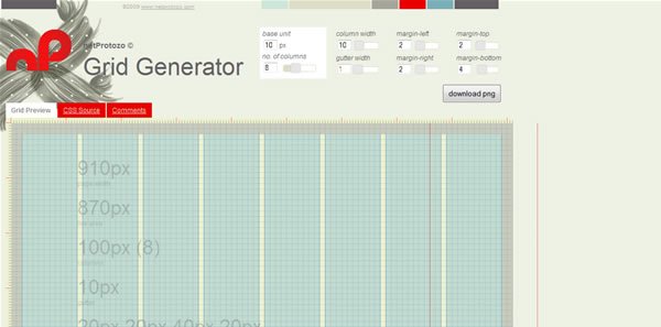
Design By Grid PNG Grid Generator - nP: Grid Generator- Use this generator to design a layout structure, specifying column, margin and gutter sizes, all referencing a core unit (in pixels). The resulting css is then ready for use in your next html layout.
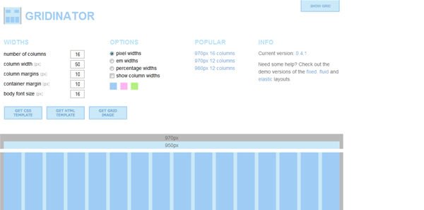
nP : Grid Generator - Gridinator- All grids are provided without guarantee, warranty or a cup of tea. There is a possibility that some em-based widths will not calculate correctly due to rounding errors; in the event of this, select another body font size. Also, the JavaScript generated numbers may not always exactly match those generated in the CSS file — rounding is a horrible thing.
Gridinator - Grid System Generator – The grid system generator will create fixed grid systems in valid css / xhtml for rapid prototyping, development and production environments.In addition to the css framework, it creates a background file that you can use in Fireworks, Illustrator, OmniGraffle, Photoshop, Visio (etc.) to aid in prototyping and design.
- Blueprint Grid CSS Generator – This tool will help you generate more flexible versions of Blueprint’s grid.css and compressed.css and grid.png files. Whether you prefer 8, 10,16 or 24 columns in your design, this generator now enables you that flexibility with Blueprint.
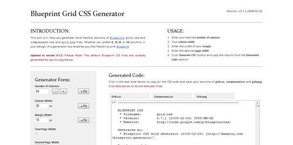
Blueprint Grid CSS Generator - The 1KB CSS Grid- This is a fresh take on the CSS grid. It can be used to streamline page templates for content management systems, its mission is to be lightweight.
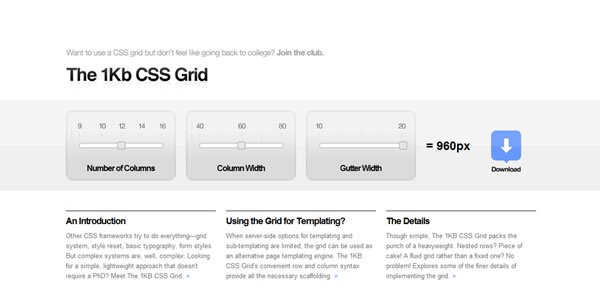
The 1KB CSS Grid - Yahoo! YUI Grids CSS, Grids Builder.This framework, which predates Blueprint, comes with six preset templates and four preset widths, and the layouts accomodate IAB ad unit guidelines. YUI Grids CSS is integrated with the rest of the Yahoo! UI (User Interface) Library.
- Blueprint CSS Grid Framework.Robustdespite only being in V0.7 (as of this writing), with lots of support from designers, and numerous tools for generating CSS code (beyond the standard 24-column, 950 px default framework). Supports the use of Blueprint “plugins”.

Blueprint CSS Grid Framework
CSS Frameworks
Here’s a short list of some of the more popular frameworks:
- YAML, YAML Builder.YAML(Yet Another Multicolumn Layout) has a fair bit of maturity, is builton web standards, and is supposedly easy to use. Though it doesn’t seem to have all that much use in the WordPress community. In fact, in the many hundreds of WP themes I’ve looked at for the last three years, I don’t recalling seeing it used once. That might be because you need a license to use it with some CMSes (Content Management Systems).
- CSS Boilerplate. Produced as a stripped down framework by one of the original Blueprint authors.
- Sparkl. The documentations says you can create 1-, 2-, or 3-column pages, but the samples suggest you have more flexibility.
- CSS Drop-Down Menu Framework
- Modular, with themes. Not only HTML is separated from CSS, but even CSS definitions are categorized into structural and thematic types. Thus creating a new css drop-down menu means creating only a new theme since structure is permanent. What is more, creating a new theme is easy with available templates and takes 10-15 mins.
- Easily deployable. The code and files are well organized. Available channels to hook up to your CMS or other tools as well as existing websites in XHTML format.
- Easily transformable. Can be transformed by changing class name only. Available transformations: horizontal, vertical left-to-right, vertical right-to-left, horizontal linear, horizontal upwards.
- Cross browser. Configurations available for Windows Internet Explorer 5 or later, Mozilla Firefox 1.5 or later, Opera 7 or later, Apple Safari 2 or later, Google Chrome 1, etc.
- JavaScript only for IE. Minimal JavaScript code only for IE 6> or earlier. Can be used with popular JavaScript libraries Jquery or Scriptaculous. Everything else is pure CSS.
- Super Fast. Having the above mentioned features it is not affected by any disturbances whatsoever.
- Continuous development. The project is constantly revised and improved.
- MoreCSS Framework – imagine creating popups, tab menus or tooltips could be ad easy and comfortable as writing some style in CSS.
- Elements CSS Frameworks – Elements is a down to earth CSS framework. It was built to help designers write CSS faster and more efficient. Elements goes beyond being just a framework, it’s its own project workflow.It has everything you need to complete your project, which makes you and your clients happy. Read the Overview for more information.
- CleverCSS is a small markup language for CSS inspired by Python that can be used to build a style sheet in a clean and structured way. In many ways it’s cleaner and more powerful than CSS2 is.
- Tripoli CSS Framework – Tripoli is a generic CSS standard for HTML rendering. By resetting and rebuilding browser standards, Tripoli forms a stable, cross-browser rendering foundation for your web projects.
CSS Optimizer and Compressor
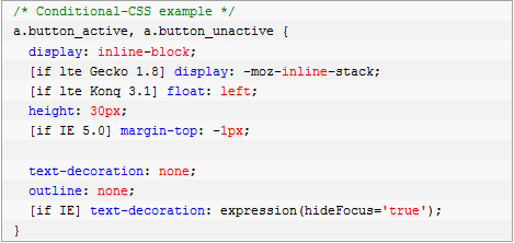
- Conditional-CSS– Conditional-CSS allows you to write maintainable CSS with conditional logic to target specific CSS statements for both individual browsers and groups of browsers.
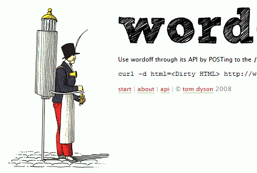
Conditional-CSS - WordOffapplies some rules to strip the cruft that is pasted into WYSIWYG editors from Word. For example, attributes are removed for all elements except <a>, <span> and <div>, empty elements are removed and consecutive line breaks are reduced to two. It also contains an API.
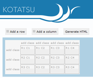
WordOff - Kotatsu – Kotatsu is a simple HTML table generator. The tool lets you attach classes to cells in the same column easily.
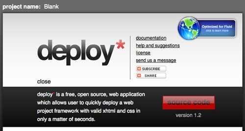
Kotatsu - Deploy- Deploy is a free open-source Web application that allows you to choose the name of a project, the Doctype, whether you want a CSS reset or jQuery integration, and it creates a zipped, ready-to-use package with all specified files and folders. The tool has been optimized for Fluid, the Mac application that creates SSBs (site-specific browsers) for websites.
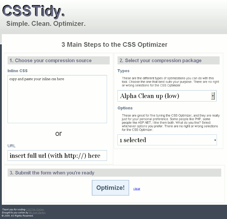
Deploy - CSS Tidy Online– An online version of CSS Tidy, a tool that allows you to keep your code clean by compressing the code.
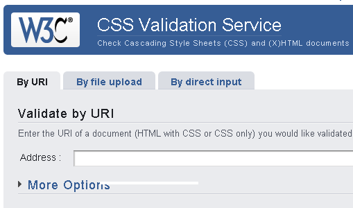
CSSTidy Online - The W3C CSS Validation Serviceis a free software created by the W3C to help Web designers and Web developers check Cascading Style Sheets (CSS). It can be used on this free service on the web, or downloaded and used either as a java program, or as a java servlet on a Web server.Do you need it? If you are a Web developer or a Web designer, this tool will be an invaluable ally. Not only will it compare your style sheets to the CSS specifications, helping you find errors, typos, or incorrect uses of CSS, it will also tell you when your CSS poses some risks in terms of usability.
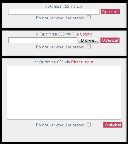
The W3C CSS Validation Service - Online CSS Optimizer/Optimiseris a web tool for reducing the file size of cascading style sheets. In order to save more space optimized files would be messy even so you may output it as a file. Non-valid or hacked (for certain browsers) CSS files may result in error.
Online CSS Optimiser/Optimizer - CSS Compressor– Use this utility to compress your CSS to increase loading speed and save on bandwidth as well. You can choose from three levels of compression, depending on how legible you want the compressed CSS to be versus degree of compression.
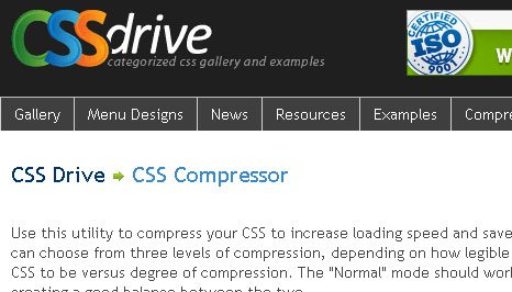
CSS Compressor The “Normal” mode should work well in most cases, creating a good balance between the two.
CSS CheatSheet
A cheat sheet or crib sheet is a concise set of noused for quick reference. “Cheat sheet” may also be rendered “cheatsheet” or “cheat-sheet.” In India, the term “Ready Reckoner” is mainly used to describe the cheat sheets. Examples include Income Tax at various levels of Taxable Income, Rate Charts for cabs etc.
I’m not make any screenshot of CSS Cheatsheet which I’ve found on the internet because it’s not necessary.
- CSS Shorthand CheatSheet
- Blueprint CSS Cheat Sheet
- Leslie Franke CSS CheatSheet
- CSS 2 – Quick Reference Guide – PDF
- Addedbytes CSS Cheat Sheet
- CSS Property Index
- Cheat Sheet CSS Shorthand Codes
CSS Reset
Resetting your styles, commonly referred to as CSS Reset or Reset CSS is the process of resetting (or more accurately – setting) the styles of all elements to a baseline value so that you avoid cross-browser differences due to their built-in default style settings. By resetting your styles, you avoid defaulting to the browser’s built-in styles, which differs from browser to browser.
- Meyer CSS Tool: CSS Reset – The goal of a reset stylesheet is to reduce browser inconsistencies in things like default line heights, margins and font sizes of headings, and so on. The general reasoning behind this was discussed in a May 2007 post, if you’re interested. Reset styles quite often appear in CSS frameworks, and the original “meyerweb reset” found its way into Blueprint, among others.
- YUI Library: Reset CSS – The foundational YUI Reset CSS file removes and neutralizes the inconsistent default styling of HTML elements, creating a level playing field across A-grade browsers and providing a sound foundation upon which you can explicitly declare your intentions.
- Tripoli – Tripoli is “a generic CSS standard for HTML rendering. By resetting and rebuilding browser standards, Tripoli forms a stable, cross-browser rendering foundation for your web projects.”A set of default-CSS-filesis supposed to give you a profound foundation for cross-browser compatible CSS-based designs. All default-values – including dozens of elements – tables, lists, typography, but also headers (h1 – h6), abbreviations, citations, quotes and forms are selected to enable an optimal legibility and well-structured text presentation.
Tripoli CSS Reset - Master Stylesheet – A lot of designers clear the styling with a global reset, but there’s a problem with doing this. Form buttons and fieldsets are among the few elements that are completely destroyed with the global reset. They lose their native styling that goes beyond the browser. Instead, you should pick-and-choose the elements you want to reset. It also makes it easier to apply your own style to common elements.
- HTML 5 Reset Stylesheet – HTML 5 is new standart, then now I’ve found HTML 5 Reset Stylesheet which based on Meyer CSS Tool: CSS Reset
- Ed Eliot’s Reset – Less is more.
This article I would like to temporarily end here, it is not listed ambitions are all the services, the most efficient tool to support writing CSS code. Each part of Powerful and Userful CSS Tools to saving your time will be more specific with many practical examples and it will continue to public in the next articles.
what a wonderfull article very usefull thanks.