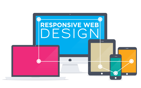
Every year, new concept in the web designing comes up. Last year, the flat design, minimalist color scheme, background videos, 3D transition effects and many more designing techniques were introduced. It was superb year for responsive web designing. Indeed, the year 2015 will be full of amazing responsive web designing concepts that will bring the biggest revolution in the web designing industry. Indeed, those designing concepts will become the trendsetters of 2015. What are those trends, this blog presents glimpse over the 2015’s responsive web design trends.
Let’s Explore the list of Web design Trends of 2015:
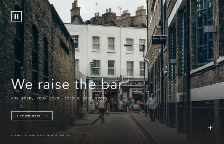
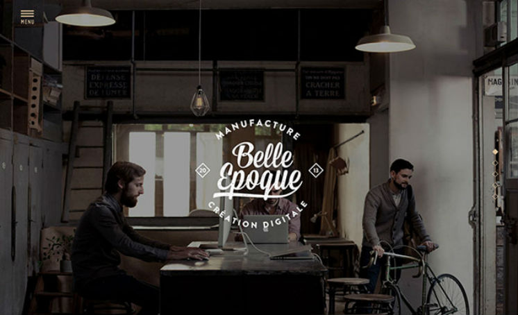
1. Vertical Split Screen
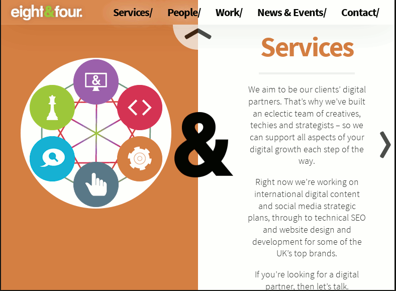
The split screen through vertical divide will definitely be the superb trend of 2015. With the help of split screen, the website owners can show dual powerful elements (associated with their organization) to the users. Moreover, you can promote 2 things spontaneously. You can see the below design that showcases the strength of technology and staff of the organization simultaneously.
2. Single Long Scrolling Page
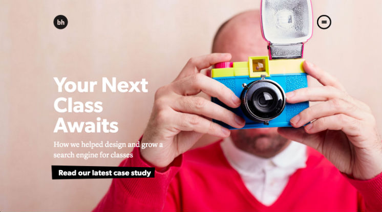
3. Minimum Or No Use Of Containing Element
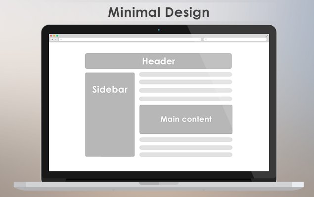
Now the use of containing elements (boxes, shapes borders and other containers) will become minimum. Today, the minimalist designs are preferred. That means the design will be crafted with the content and all the elements of design will be contained in single container. For example, in the below given design, from content to the image all the elements are integrated and there is no container.
4. Storytelling Design
Content still plays an important role in design. The storytelling design can be the best tool for promoting as well as advertising the products & services. It can optimize the interactivity between the visitors and the organization website. Moreover, it will also help you present the imperative information about your company effectively.
5. Filling Whole Screen
The design that fills the whole screen will give the best view of the website to the mobile user. But we need to take care that all the contents are properly placed because there is no
scrolling technique in design. This type will become the choice of designers in 2015.
6. Hidden Main Menus
Hide the main menus until the visitors click the icon on screen. This type of design pattern has been adopted by many designers. By hiding the main menus, the website owners get more space to display the imperative content regarding the organization. That can also enable the visitors to know more about the company. The concept of hiding the main menus in design will become the superb trend of 2015.
7. Google Material Design
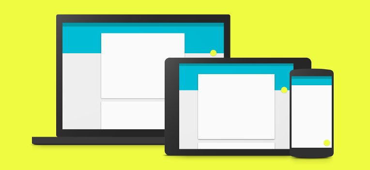
The Google material design will bring a revolution in the designing pattern. The material design gives tactile appearance to the different elements of the design. With help of material design, the designers can add beautiful transition, interaction and animation effects.
8. Scalable Vector Graphics
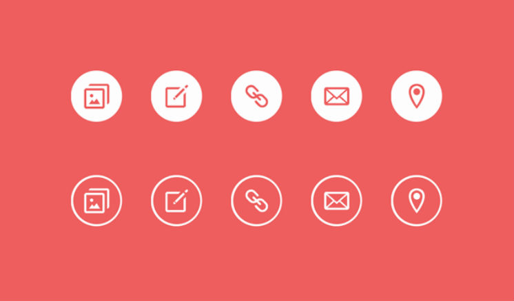
By deploying the SVG (Scalable Vector Graphics) format, the designers can implement flat & material design. Indeed, it helps you focus more on design than on screen resolution. Moreover, as it has lightweight, it will not hamper loading speed of the website. It can be easily manipulated with the help of CSS and JavaScript.
9. Responsive Design With Mobile First Approach
Designing the website with the mobile first approach is the best way because this makes the website more flexible and interactive. As we know that the market of tablet and smartphones have surpassed the desktop and laptop, it has become necessary to deploy the mobile first approach responsive design.
10. Custom Typography
Typography has become the most important elements of web design, it helps the website designers set tone, message and theme of the websites. It enhances the readability of the content and brings flexibility in the website. The custom typography comprises manipulation of not only font, but also typefaces and whitespaces in order to optimize the communication process and interactivity.
11. Design That Accesses Less Input
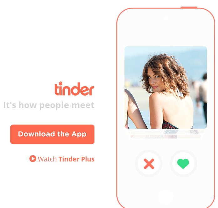
The mobile users mostly prefer to input less data. Therefore, it is imperative that the designers should structure the websites that will ask for less input. This will improve the user’s experience. For example, tinders app has been structured with yes/no feature. According to users’ input, this app understands that what users want and respond in the best manner.
12. Interaction Design
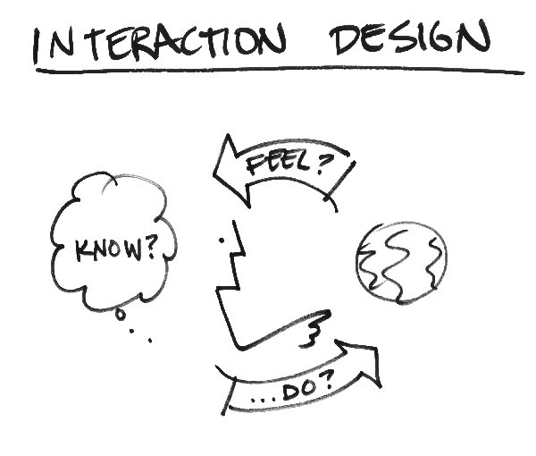
Interaction design plays the most important role in improving the user’s engagement with the website. In fact, the interaction design even helps designers deploy the storytelling content superbly.
13. Grid Based Responsive Design
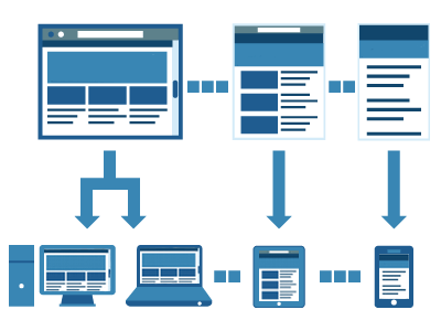
The Grid based designs are popular in simple website design, but what about implementing grid based layout with responsive design. This pattern will give easy access of imperative web content to the mobile users. In this design pattern, the size of module/grid changes according to screen sizes.
14. Lettering

Lettering is the process of developing the illustration of numbers, characters, letters and phrases. Nowadays, lettering in the web design has set up trend because it not only beautifies the website, but also offers important information to the online visitors.
15. Large Headers Without Background Image
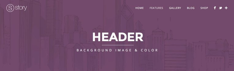
The large header without background image has become the most important trend. By implementing large headers without any background image improve the mobile website’s performance and make the webpage interactive.
Besides all these things, the designers are shifting their paradigm in designing the web app for wearable devices, like Android wear, Apple Watch, etc. After all, this year will definitely be year for wearable devices.
Conclusion
Apart from all these responsive web design trends, more new web designing concepts will come up and set the trends. We will discuss those soon. If you have any new information regarding website design trends, then you are most welcome to share with us.

Thank you. Great post! 🙂
Great tips! very clear and very and condensed.