17 Unique Web Design Ideas to Explore for Your Website in 2017
Here are some of the fantastic web design styles that are currently dominating web technology and which you can explore for your next website design or re-design.

Here are some of the fantastic web design styles that are currently dominating web technology and which you can explore for your next website design or re-design.
Why not create a designer footer for your website or a personalized one to impress visitors with something that they haven’t seen before! Here in this article, I have compiled a list of best and amazing examples of responsive websites adorning impressive footers. These examples will definitely convince you with the features and impact of the footer designs.
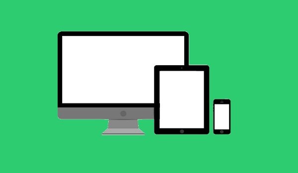
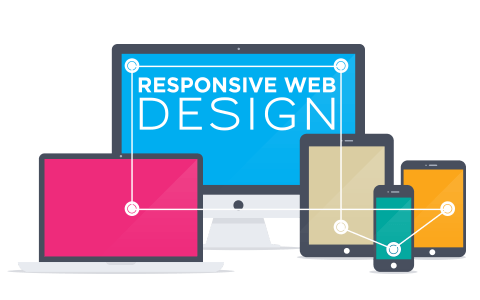
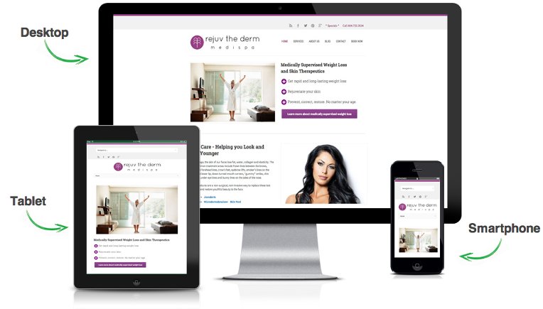
Responsive Web design (RWD) is an approach to web design, it aims at designing sites to provide the best possible viewing and interaction experience. It suggests that the response of the design and development should be based on the user’s screen size, platform, orientation etc.
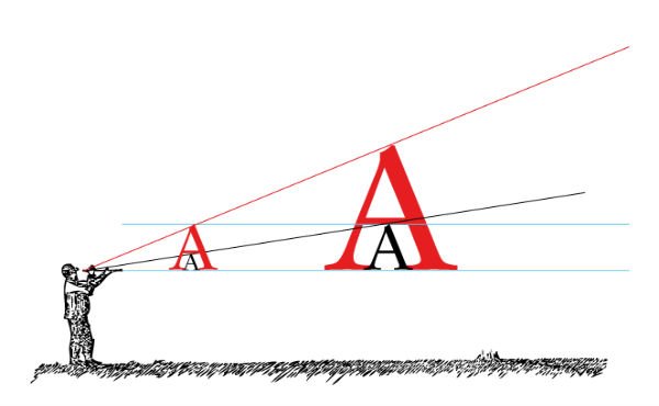
In this post, I will decipher certain key aspects that are imperative to create a prolific responsive web typography. It will also uncover some resourceful guidelines that can help you attain an enticing and legible web typography.
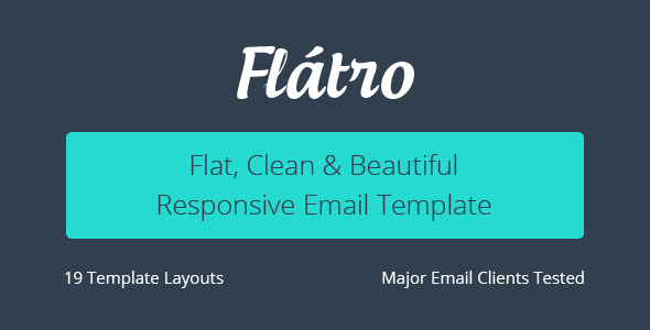
The design trends has changed then focusing on mobile devices as well as it. In today’s post we have gathered trendy flat style responsive email templates to market your online business.
What are those trends, this blog presents glimpse over the 2015’s responsive web design trends.
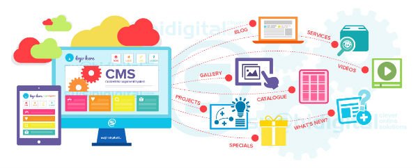
The future in the web design and development realm is unpredictable, but the ongoing trends always leave us with suitable clues and possibilities that can help businesses develop in the correct directions. With the ever growing list of competitors and ceaselessly fluctuating user behaviors, the CMS platform have to take bigger strides towards accelerated enhancement to ensure their surefire market presence in the future.
An impressive visual appeal and responsiveness are two attribute that often find themselves pulled in opposite directions. But combining your skills with the right set of tools, you can indeed make them work collaboratively.
All of the above three options can help you build a strong mobile presence for your business, but each of them has its own benefits and downsides. And so, you should understand which one of them befit your needs.
The agenda of this post is to help you better understand which option best fit your needs of promoting your mobile presence.

Responsive websites are easier to maintain and update as compared to mobile websites. If your rivals do not have a responsive design yet, this can be your chance to outshine them.