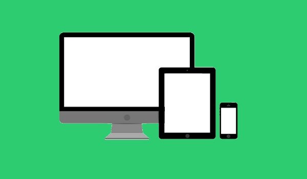
Web design and development, the ever evolving field where it has become almost impossible to keep up with the new resolutions and designs. It is unfeasible for most websites to come up with separate versions for each new resolution and device. Responsive Web design makes sure that we do not have to lose visitors from one device for the sake of gaining them for the other.
Responsive Web design (RWD) is an approach to web design, it aims at designing sites to provide the best possible viewing and interaction experience. It suggests that the response of the design and development should be based on the user’s screen size, platform, orientation etc. Let’s say that if the user switches from Laptop to Mobile, the website would have the technology to respond to user’s preference. This removes the need for fresh design and development for each new gadget in the market.
The Theory behind RWD
The term Responsive Web Design was coined by Ethan Marcotte when he wrote an article on “Responsive Web Design” about it for A List Apart.
The term was originated from the idea of Responsive Architecture, as per which a room responds and adjusts to the presence of people passing through it. Applying the same principals to Web Design, we conceive a similar, yet a completely new idea.

Alike responsive architecture, Web designs should adjust automatically. That is to say, we do not need to create separate Web Designs for separate set of users, need not to make infinite personalised solutions for each new group of users.
Certain methods of Responsive Web Design such as fluid layout, scripts to reformat web pages and media queries are already in practice. But the essence of Responsive Web Design is not just in adjustable screen resolutions; rather it is about a whole new way of thinking.
Adjusting Screen Resolution
With an ever increasing number of devices, there come varying screen resolutions, definitions and orientations. The devices screens may be in landscape, portrait or even square. With the moderns smartphones it has been seen that the screen orientation can change from portrait to landscape at one simple gesture of the user.
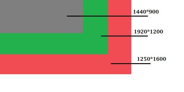
Along with designing for both Landscape and Portrait, one also has to take into consideration various other screen designs as well. Even if one does decide to categorise these hundreds of screen sizes and design each one of them (keeping them as flexible as possible), it is still un-feasible. This is because we cannot tell what their usage figures will be in the times to come. Besides, most users do not browse with the browser maximised, hence, leaving a lot of variety for screen sizes.
FLEXIBILITY: A PART SOLUTION
Until a few years ago, columns and text were the only things that were flexible in a web design. Structural elements that were flexible would often break layout when pushed enough. Images would also break layouts with ease. Flexible designs could only but adjust a few hundred pixels but not a large computer screen to a netbook.
Things have become more flexible now, with images that adjust automatically, and layouts not breaking now. Even though it is not an absolute solution, but it certainly increases the number of options. For users switching from large computer screens to an iPad or using devices that change orientation from portrait to landscape, this works perfectly.
Marcotte created a sample web design where he uses fluid grid, fluid images and smart make up to make the layout more flexible. Creating fluid grids is a very common practice. Hiding and revealing parts of images, creating sliding composite images, foreground image scaling with layout are just a handful techniques used for the purpose.
If seen from technical point of view, all of this is easily done but it is not just about inserting these features and being done with them. But even with smart fixes, the final product may not be perfect; it may turn out to be too wide or too long.
Custom Layout Structure
In case of changes of huge proportions, one may have to completely change the layout. It may be done by a CSS media query or through a separate style sheet. In this case most of the styles tend to remain unchanged, as specific style sheets can accede to these styles. They move elements around with float, width, height etc.
Let’s say, there is a main style sheet that defines all the main structural elements. In case the lay out made by the style sheet turns out to be too wide or too short, it could be detected and we could just switch to a new style sheet. Along with adopting everything from the default style sheet, the child style sheet would re define the layout.
MEDIA QUERIES
A media query consists of a media type and at least one expression that limit the style sheets’ scope by using media features such as width, height, and colour. Apart from supporting all sorts of media as CSS2.1(screen, print etc.), CSS3 has added new features. Devices such as Android and iPad support media features. Therefore, when targeting these devices, calling a media query using CSS3 features should work perfectly.
Apart from max width, device width etc, the new CSS3 features also boasts of orientation. It helps you with the altering of the basic layout, so as to fit ranges of width.
CSS3 MEDIA QUERIES: How do they work?
Now that we have talked about media queries, we turn our focus particularly to the working of CSS3 media queries and see how they can be used to create a RWD.
The CSS3 consist of Min-Width and Max-Width properties. Now just as the name suggests, the max-width property sets a maximum limit to the screen or browser. Anything exceeding the maximum limit would not apply to the media query. The Min-Width works in the exact opposite way.
There is also the Min-Device-Width and Max-Device-Width media query property. This property does not apply same styles to other screen sizes in a browser that are the same as the device’s size, rather it s targeted at certain devices with particular dimensions.
Specific devices can be targeted by media queries through other ways as well. Thomas Maier has targeted iPhones and iPads in two of his snippets.
There are many media queries, such as the min-width max-width query that are more useful when combined.
JAVASCRIPT
JavaScript, which is usually used as a backup for devices not supporting CSS3, is also a useful method.
One must remember that media queries are not the permanent solution, they are just wonderful options for Responsive Web Designs. There are many ways that JavaScripts can be paired with CSS media queries. The inclusion of JavaScript helps in leading to far greater variations.
Flexible Images
Images are a major issue when it comes to Responsive Web Design. There are multiple ways to proportionally resize an image. The most common one though is using CSS’s max-width.
With the maximum width of the image set to 100% of the screen, when the width narrows down, the image narrows along with it. The images are loaded in their original size, unless the viewing area is narrowed down. This technique is uncomplicated and works wonderfully when it comes to resizing images.
IE does not support max-width property, but the problem can still be cleanly solved in an IE specific style sheet. Also, JavaScript helps in solving the issue of unclear rendering in the older browsers of Windows.
IPHONE IMAGE RESIZING ISSUE
The Iphone has a wonderful feature whereby it re scales the web designs to fit the screen size by itself. The complete web design would reduce to the size of the tiny screen hence removing the need for the user to scroll around.
When RWD came into being, it was noticed that even when the images were specifically made the smaller screens, they were still shrinking in proportion to the page. Hence, it would scale down the text and other elements involved.
FILAMENT GROUP’S RESPONSIVE IMAGING
Even though resizing images for mobile devices is quite easy, when the images are meant for larger devices, things get tricky. In this case it could significantly slow download times and take up unnecessary space.
Tackling this issue, this new technique by the Filament Group shrinks the resolution of the images on smaller devices, hence saving the unnecessary space they might take up.
It is fully supported by the likes of IE8+, Safari, Chrome (and their mobile versions) all of which are modern browsers. Older browsers too degrade and resize the images. The only downside being that both versions are downloaded together, hence nulling the advantage of space saving from this technique.
CONTENT DISPLAY
It isn’t always best having all the content from Large Screen moving to the Small Screen. When working on the small screen, easier navigation, pin pointed content and having rows instead multiple columns proves advantageous.
Eventually it is not just about creating a host of flexible layouts for multiple devices and platforms; rather it is about letting the user pick and choose the content. CSS allows you to show and hide content. Other than just hiding content for small screens, for larger screens, it also lets you hide content in the default style sheet.
It is important to know the difference between visibility and display. ‘Visibility’ changes just hide the content, where as ‘display’ completely removes it.
A design can be altered to fit a huge variety of screens and devices by automatically resizing of images, rearranging layout elements etc.
TOUCHSCREENS
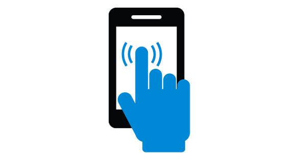
Recently, touchscreens have gained huge popularity. As of now, even though the touchscreen function is mostly limited to smaller devices, many laptops and larger devices are also taking up the touchscreen functionality.
HP TouchSmart is a typical laptop, but it can transform into a tablet.
It is interesting to know that making a design work for both cursor-based devices and touchscreen devices isn’t all that hard as it may seem. You cannot rely on CSS hovers; this is because due to no cursor, touchscreens can’t display CSS hovers.
Many touchscreen based design can be found, also they do not necessarily harm the cursor based users. Certain aspects of touchscreen based design make no difference to cursor based users.