
In 2009, I listed some WordPress plugins to make your website mobile friendly. Just over 6 years and the SEO, Technology … have changed. Do you know? Google is cracking down on mobile-unfriendly sites. If your site isn’t optimized for mobile, you’re losing a whole chunk of users on the go who will quickly look elsewhere if your site does’t load on their device.
In this post, I’ll look at the top mobile optimization plugins available for WordPress and offer some recommendations.
Check your pages with the Mobile-Friendly Test
Before proceeding to different ways of making your WordPress site mobile-friendly, we recommend you to test how well your website looks on various devices. It’s simple and FREE by using Google Mobile-Friendly Test.
I’ve research over Internet then found some useful Mobile-Friendly Test/Check/Valite Tools:
- W3C mobileOK Checker: This checker will perform several tests on your website to determine how much friendly it is to mobile devices. Your website will be called mobileOK, if it passes all the tests successfully.
- Mobile Test: Test your mobile and responsive web designs in more than 50 smartphone and tablet emulators.
- MobiReady: This handy tool will let you test your website’s W3C mobileOK and dotMobi compliance, and provide you report about how well your website will perform on mobile devices.
What’s benefit of Mobile-Friendly Website?
- More traffic
- More social shares
- More sales
- More email subscribers
- Access of your site in all devices
- Better user experience
These reasons should empower you to set up a mobile-friendly version of your blog.
How To Make Your Blog Mobile Friendly
- Avoids software that is not common on mobile devices, like Flash
- Uses text that is readable without zooming
- Sizes content to the screen so users don’t have to scroll horizontally or zoom
- Places links far enough apart so that the correct one can be easily tapped
Read the documentation about Webmasters Mobile Guideline on how to create and improve your mobile site.
Using The Responsive WordPress Theme
Using a Responsive theme is one of the best approaches to make your WordPress site mobile compatible. If a WordPress theme design is said to be “responsive” that means that all the contents and the layout responds to the screen that views it. While using a responsive theme, one of the best things is that you don’t have to worry about mobile optimization or using any plug-in for your website.
Personally, we recommend you to purchase a high quality responsive theme from a reputed WordPress theme provider such as Elegant Themes and MyThemeShop.
We’ve listed some awesome, beatiful and responsive WordPress themes, you can take a look on them to use for your website.
At this time, we’re using and interesting with some responsive WordPress theme:
Separate Mobile Friendly and Desktop Layouts
You can separate mobile theme and desktop theme to differenc location. That’s way, whenever visitors will enter the original URL of your site on a mobile device, they’ll be redirected to the custom mobile URL through domain mapping. I will mention to the solution in next post.
Transform WordPress layout to mobile friendly with plugins
If you don’t want to use a responsive theme or you create your own themes that is not mobile friendly and can’t convert it right now, you can use WordPress plugins to optimize your WordPress site for all types of mobile devices.
If you have a WordPress blog that still needs to be optimized for mobile viewing, use the plugins listed below.
1. HandHeld Mobile Plugin by ElegenThemes

HandHeld is a WordPress plugin that works alongside your normal theme, serving an alternate layout to your mobile visitors. This alternate design creates an enhanced mobile experience, and is only shown to your users when they visit your website on a mobile device. HandHeld will work beautifully on modern Android and IOS phones, and is coded in HTML5.
Device Compatibility
The Handheld Mobile WordPress Plugin from Elegant Themes is a useful add on that lets you show a alternative design to your mobile visitors. But the Handheld Mobile plugin comes packaged with the Elegant Themes membership, which retails for $89 a year. The membership comes with 87 quality WordPress themes and 5 WordPress plugins. Unfortunately, the plugin is only available through the membership and can’t be purchased on it’s own.
2. JetPack Mobile Theme by Automatic
 The WordPress.com default Mobile Theme displays your content in a clean, uncluttered interface, making it easy for mobile visitors to scan your site. Furthermore, they took special care to make the mobile theme as lightweight as possible to ensure faster loading times. This free plugin offers a vast array of features to supercharge your blog. One that optimizes your blog for mobile viewing is the Mobile Theme feature.
The Mobile Theme gives you different options:
- Display either excerpts or full posts on the home page and archive pages.
- Show a promo for the WordPress mobile apps in the footer of the mobile theme.
Once you have activated mobile theme feature for Jetpack, you can customize the header and background of your blog’s mobile version. The Mobile Theme displays one sidebar below the main content area, just above the footer. This ensures that your content has as much room as possible on smaller screens.
3. Obox Mobile by Obox Themes
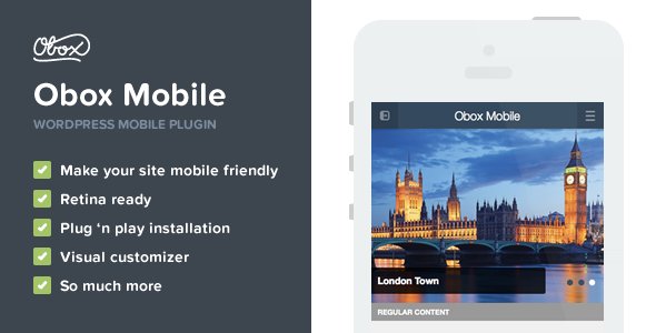
The plugin has undergone a complete design overhaul, both the theme, the admin options panel and the features have been upgraded and improved. They’ve updated the layout to make it more usable with a sleek widgetized side-bar, improved slider and a massive amount of visual customization.
- Obox Mobile removes all the extra bits that aren’t necessary on a mobile device, making it much faster than responsive themes.
- Pages are designed to display only the most important content. All unneccessary noise has been removed or hidden.
- Brand your mobile site exactly to your requirements by changing colors, fonts, logos and backgrounds.
Obox Mobile is the first WordPress mobile plugin with a sidebar for all your favourite widgets as well as search, categories, latest posts and more.
Which plugin is best for you?
Do let me know which method you prefer to make your WordPress site mobile friendly? Do you use any plugin or any 3rd party services?

Hi Nguyễn,
Very nice post. Duda is also very good plugin to build a Mobile Website.
Fantastic plugins thanks for sharing them. Now website should be mobile friendly it’s become a ranking factor.
I have been using WPtouch Mobile Plugin since 2016.Yes,Works prefect on mobile device why n’t list WPtouch mobile plugin here? hand held a popular plugin by elegant themes but price is high for me.thanks for the mobile plugin list 🙂 I really appreciate it
Thanks for your suggested, I will testing that plugin then mention about it after done.
Hey there,
Thanks for your nice article on “3 Fantastic Plugins to Optimize WordPress Mobile Friendly”. Hope your guideline will help users to take a decision to use one from this list for their site.
Yes, I’m writing an article about your comment. Just wait!