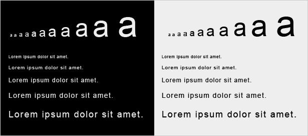
In CSS3, you’re found sixteen (Yes, sixteen!) different units by which you can measure the size of text with font-size attribute. Some have their history in typography, such as point (pt) and pica (pc), others are known from everyday use, such as centimeter (cm) and inch (in). Some units are very popular but there are rare units or don’t use in website development. In this topic, I’m telling you about the summary of these attributes which is best suited for your website.

What’s about that?
There are two types of measurement units: relative lengths and absolute lengths.
- relative lengths: Relative length units specify a length relative to another length. The relative units are: em, ex, ch, rem, vw, vh, vmin, vmax. They are mainly useful when the output media has dynamic size like mobile device, laptop…
- absolute lengths: are fixed in relation to each other and anchored to some physical measurement. The absolute units are: px, mm, cm, in, pt, pc.They are mainly useful when the output environment is known.
As you known, we got two types of measurement units and two types of media output: screen and paper. In this post, we’ll talking about measurement units to sizing the text on screen.
Meet the Units
Absolute length units
- px: One device pixel (dot) of the display. (1px is equal to 1/96th of 1in)
- mm: One millimeter.
- cm: One centimeter (10 millimeters).
- in: One inch (2.54 centimeters).
- pt: One point (which is 1/72 of an inch).
- pc: One pica (which is 12 points).
Absolute length units are best suited for paper, low-resolution screen or has a closed view from eyes to screen.
Relative length units
- em: font size of the element
- %: percentage values are always relative to another value, for example a length
- ex: x-height of the element’s font (1ex ≈ 0.5em in many fonts)
- ch: width of the “0” (ZERO, U+0030) glyph in the element’s font
- rem: font size of the root element
- vw: viewport’s width, 1/100th of the width of the viewport.
- vh: viewport’s height, 1/100th of the height of the viewport.
- vmin: minimum of the viewport’s height and width
- vmax: maximum of the viewport’s height and width
- keywords: xx-small, x-small, small, medium, large, x-large, xx-large
So, What’s the Difference?
Generally, the relation between the measurement units is as follows:
- 1em = 12pt = 16px = 100%
- 1in = 2.54cm = 25.4mm = 72pt = 12pc
As you see, the absolute units (cm, mm, in, pt and pc) will appear as exactly that size in CSS as everywhere else. They are not recommended for use on screen, because screen sizes vary so much. For this reason, the relative length units are best suited for the web developers.
In web authoring, em and percent are most common unit. Since CSS3, you will find rem unit that appears quite frequently.
Em vs. Percent vs. Rem
em, percent and rem means they are related to the font size. Because em inherits size from its parent element makes it a little difficult to sizing the text; if the user has a big font (on a big screen) or a small font (on a handheld device), the sizes will be in proportion.
Let’s see what happens when we convert 1em equals 10px, instead of the default 16px then we sizing the text in list
body { font-size:62.5%; }
h1 { font-size: 2.4em; }
p  { font-size: 1.4em; }
li { font-size: 1.4em; }
HTML code
 ...
 ...
- ...
- ...
- ...
Now, we found the problem with em-based font sizing is that the font size compounds. So, rem is a new unit is in development to make it even easier to make style rules that depend only on the default font size. That means that we can define a single font size on the html element and define all rem units to be a percentage of that. Unlike the em, which may be different for each element, the rem is constant throughout the document.
What’s about keywords?
I’m not using the keywords unit although keyword sizing is pretty consistent across browsers and platforms because it’s can not handle the typography, as the choices are fairly limited.
Conclusion
Now, the em and percent units are standard for font sizes on the web, but in practice, the rem unit seems to provide a more consistent and accessible display for multi screen sizes. Other units like vh, vw …in deep development, it’s need more time to testing and appearing in web authoring.


Good Post.