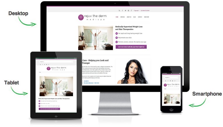
Giving you a reasonably germane cause for pause, website responsiveness is not a luxury that you can afford to *not* have. In an era where Internet users are leaning towards the mobile way of accessing the web, the importance of having a responsive website has increased manifolds. The brands that have been vying to create a dominating presence over the web have come to this inherent realization that having a visually remarkable website can only take them so far. If the diverse platforms like different OS platforms and screen sizes don’t find the visually enchanting websites compatible enough, the users aren’t likely to stick around and navigate.
The web designers, once in a while, should enjoy the license to break free of the constraints and exercise their creativity in an unbridled manner. But, there has to be a method to this madness. Working in unison with diverse platforms is what counts at the end of the day.
Why You Need to be Responsive
Your target audience visits your website when they are:
- Randomizing while sitting in a mall
- Sitting bored in the university library
- Sleepyheaded at the back bench of the lecture
- Waiting for the order to be delivered at a food joint
- Sitting at home/office, right in front of their desktops
Evidently, your visitors can’t drag their desktops everywhere they go. And that’s why science gifted us Smartphones! All they need to do is tuck one in your pocket and stay connected to the web from even a chok-a-block bus ride. And that’s when your brand needs to have a website that works in perfect unison with their Smartphones’ OS and displays perfectly on the much-smaller screen sizes.
No, ‘Responsive’ Doesn’t Spell ‘Dull’
All said and done, it is a fallacy that tailoring website to be responsive with a diverse set of platforms means making it dull and tedious. For a webmaster who wishes to catch the fancy of Internet users through a remarkably attractive design, there are ways to not compromise on the visual appeal and still retain the compatibility of the site across different platforms.
A Few Root-Level Ways
- Choosing a responsive theme that suits your design sensibilities as well is the most obvious approach to creating a responsively beautiful website. The WordPress keeps coming up with newer themes and as the traction towards the responsive aspect has increased, the good quality chunk of those consist of responsive websites. Now, stumbling into a responsive website that looks vibrant as well is a matter of research.
- If you can’t find a readymade WordPress theme that suits your taste, why not go ahead with custom creating one? Hire some pros who know their way around WordPress and have the wherewithal of creating WordPress themes that stay true to your requirements. Apparently, this exercise will require you to invest a fair bit of money, but when creating a formidable website is n the agenda, you got to let loose your pockets a bit.
- If you have already been running a website that has a reasonable proportion of followers, and creating an altogether new theme doesn’t seem like a viable option, you can make your current theme responsive. All you need to do is to make some very specific changes in the stylesheet of your theme to make it more attuned to your requirements. Again, making these changes would require an expert’s help. For your consideration, this statement can help your website adapt itself to different screen sizes: @media screen and (max-width: 360px). With this piece of code added, your theme is getting a message that whenever the website is being accessed on a screen size of 360 px or lesser, the styesheet used to display the site would be a different one.
- Use images wisely. We understand the need to adorn a particular post with incredibly appealing images, but if those images take an eternity to load on a mobile phone, what’s the point? There are various WordPress plugins out there that can help you reduce your image’s size without affecting the quality.
- The text in your website needs to suit the device it is being displayed on, and for the same, you need to resize the font. Use this code for the same:
body {
font-size: 50%;
line-height: 1.3em;
}
Branch Out to the More Typical, but Far More Effective Responsiveness-Enhancers
Adding responsiveness to your website using third party tools is not all about installing the WordPress plugins. There are rather much more potent tools out there that give you the complete customization capability to alter the very nature of your site, while retaining its visual appeal and enhancing its responsiveness. These include:
Wirefy
A responsive site is one which is structured in a compact manner and makes it easy for the requests to find their way to the browser that’s trying to access the website. Wirefy is a rapid prototype tool that consolidates your website and helps you plan out your content in a cleaner and compact manner. With the content being appropriately distributed across the site, you have more freedom while styling the website.
Bootstrap
A name to reckon with, Bootstrap is among the most popular tools used for enhancing a website’s compatibility across different platforms. It uses the grid structure to lend your website with a sense of structure and thus makes prototyping easy and much more result driven. Bootstrap is essentially an open source front end framework that gives you an easy access to a variety of elements that help you boost your website’s speed and agility. These include the HTML and CSS based design templates, Minify CSS, JQuery plugins, JavaScript extensions, Customizers and much more. You are also provided a diversified set of stylesheets that are based on LESS. You can group buttons in the form of drop down, tailor the tabs in vertical or horizontal form, equip the site with advanced typography, etc.
Gridset
Another pricelessly important tool for adding modularity to your website and making it more customization ready, Gridset is essentially a spatial reference system that can be used not only for WordPress sites, but also for websites built on content management systems like Joomla and Drupal. The underlying concept with this tool is that it helps you steer clear of the convoluted column configuration calculations whenever the website has to be tailored to adapt to a unique screen size.
FitText
the tool stays true to its name and helps you in priming up the text placement in your website. It is, in its bare bones, a jQuery plugin that assists your website in adapting to varying screen sizes and displaying the text in a manner that is much more readable and clutter free. The plugin is particularly resourceful for the websites that are content rich. Typography is an indispensable contributor to the responsiveness of a website, or to the lack of it. And with FitText, you are certainly taking a giant leap towards sprucing up this responsive attribute.
An impressive visual appeal and responsiveness are two attribute that often find themselves pulled in opposite directions. But combining your skills with the right set of tools, you can indeed make them work collaboratively.