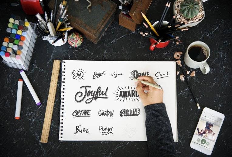
A logo is a key element of any brand design, and there’s no need to explain that it’s of paramount importance. To shed light on the issue we’ve decided to share our personal experience in working with different clients and different domains and to explain how to create an eye-catching & efficient logo.
![]()
Have you ever happened to go deep into research, examine demographic peculiarities, gather historical notes, study thoroughly graphic materials, created by all the market players within a certain period of time to be ready to give a great long-term logo idea for your client?
Sure you have. But have you come across the situation when after this intensive work your client admits: “It’s not the right fit for our company”, at the same time ignoring your strong and convincing arguments?
Indeed, not all the customers are familiar with what is called a cool design. And, unfortunately, designer’s authority vanishes and he/she is hardly to change the client’s mind.
A funny story to share: we have had a client who paid for our creative team’s work, but turned to other company to get a different graphic concept, at the same time trying not to hurt our designers’ feelings.
So, here appears the first practical advice: domain research is a vital thing to do, BUT to enjoy success, it’s more important to understand client’s tastes, wishes, and expectations. You can check how to follow customer’s ideas in practice in this Logo design case study.
Without any doubts, your client will show you some rivals’ logos that in his/her opinion are really successful role models, and you will be asked to create “something like that”. We have made sure that an attempt to reconstruct or adapt someone other’s graphic concept is self-defeating in its nature.
The customer will seek similarities and differences between the two logos, so, such a success-story-based approach won’t work.
That’s why our second piece of advice is to elaborate an absolutely new concept, as a fresh solution has more chances to prevail by winning client’s and market’s approval.
Try to always take the lead and make good progress. Everybody knows that there are no highly strict rules and guidelines for creating a logo. A graphic concept may and must get changes, so have a brief look at your competitors’ cases, follow domain tendencies, and make all the necessary changes in the logo and other accompanying materials. A smooth update of your clients’ website graphic components will stimulate users’ interest and will entice new product/service purchasers.
<2 id="4-conservatism-plagues-young-designers">4. Conservatism plagues young designersMany domains are evidence of conservatism both in design and UX. Vivid examples are banks and healthcare institutions. And if your client works exactly in these areas the process of logo creation will become much more complicated for you.
The abovementioned spheres are notable for their long standing character graphics, so here designers will certainly face a challenge of offering something fresh, unique and, what’s more important, something non-conservative and suitable.
Our tip here is to assign such tasks to more experienced designers, as young creators seem to face problems in following the client’s mood dealing with such a conservative sphere.
Each client wishes to have a cool logo, somewhat unique and recognizable symbol. Let’s be fair: the creation of a “readable” and recognizable logo is kind of art that not any creator possesses.
If your client has a firmly established logo with right associations, it will be immensely difficult for a designer to create a new suitable sign, as during its launch different segments of the target audience may misunderstand the message. The ideas that seem easy to perceive may be misunderstood outside the brief-room.
A piece of experience: we came across a food company that had a shouting readable traveling logo, so, nobody understood the organization really dealt with food.
Another piece of advice here is to stop chasing pithy symbols. It’s better to obtain the most suitable one via an array of adjustments and adaptations.
Of course, every designer will prepare logo variants for a business card and for a website header. Just bear in mind that users have mobile phones with different screen sizes, so, it’s vital to adapt logos for a smaller resolution, sometimes by eliminating tiny details or by dividing a complex logo into meaningful parts.
<2 id="conclusion">ConclusionAll in all, any tip given can’t be considered a universal one, as there are different cases and different clients. But to create a highly successful logo you will certainly have to listen to your customer and adapt yourself to the working and market environment.