With the web being 99% typography, typography makes a foundation of web design and interaction. Having said this, it is clear how preeminent the typography is for creating a successful website or web application.
Gone are the day when we had a specific number of devices. Although today, we have a great control over our work, it can’t be gainsaid that the ever-fluctuating pool of devices has created more complications than ever before. Thus, an attempt to accomplish the work without taking the key fundamentals into account could ruin all your efforts.
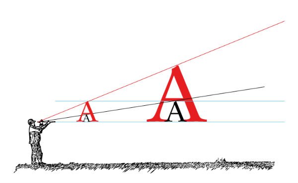
A simple text on a wide blank page might appear minimalist. But, have you ever wondered that how decreasing the screen size to fit small-screen devices will influence the text? It will look awful. This has certainly led to responsive typography that can automatically adjust itself to the targeted screen while ensuring easy readability and great quality.
In this post, I will decipher certain key aspects that are imperative to create a prolific responsive web typography. It will also uncover some resourceful guidelines that can help you attain an enticing and legible web typography.
Without any further ado, let’s delve deep into the topic.
Responsive Web Typography – A Foreword
A responsive design hardly makes a sense without textual content. I don’t think that responsive design needs an introduction, as it has been around for a while now. However, responsive web typography might sound like something fresh to you. This design approach, amazingly helps breakthrough the challenges created due to the proliferation of advanced mobile devices.
The web typography is an essential chapter for every web designer and developer to deliver an outstanding web solution, and so is the responsive web typography. It helps ensure that your web content, especially the textual content responds appropriately to the targeted screen.
Web content is an inevitable part of a product (website or web app) that can influence the likelihood of your product success, which will eventually lead to your business success.
Golden Rules To Effective Responsive Typography
You can use CSS to tweak most of the typographic components. It not only optimizes the text to fit on each viewport, but it is a lot more than that. There are a number of considerations that one should keep in mind while working upon responsive typography to make your web solutions efficiently reach on various devices. Here are a few of the useful key points to consider for creating a better typography.
1. To include peculiar style use CSS3 pseudo-classes

With the help of CSS3 technology, you can proficiently target paragraph, line or even a specific character, and define a different style. It, thus, enables one to tweak the text size to make it appear captivating on different screen sizes.
There is a huge list of selectors available under the hood of CSS3 pseudo classes. Some of them are listed below.
- first-of-type: the first element of its parent in the <p> is selected
- last-of-type: the last element of its parent in the <p> is selected
- first-line: the first line of its parent in the <p> is selected
- last-child: the last child of its parent in the <p> is selected
- first-letter: the first letter of its parent in the <p> is selected
You can choose a suitable one and manipulate the style of your web content in a desired fashion.
2. Ditch pixels and ems for rems
No doubt, pixels and ems, both are popular measurement units that are widely used across the globe. Pixels are fixed units of the parent element, while ems are relative units. Thus, both these units make it hard to identify an appropriate size needed to attain a desired outcome.
Fortunately, rems make a better option. Rems (“Root em”) is equivalent to the font size of the root HTML element, and compatible with modern browsers.
Let’s consider an example.
Code Snippet Rem example:
html{
  font-size: 15px;   // 1rem = 15px
}
h1{
  font-size: 1.8rem // 18px
}
h2{
   font-size: 1.7rem // 17px
}
In the above example, 15 pixels (which is also the reference of the other element’s font size) are defined as a base font size. And, the h1 abd h2 size will change along any changes in the viewport.
To make it efficiently work on the previous versions of Internet Explorer, the font size must be first set in pixel units, while the rem units must be defined along side. This will help create a valuable text in various browsers.
html{
  font-size: 15px;   // 1rem = 15px
}

h1{
  font-size: 18px; font-size: 1.8rem;
}

h2{
   font-size: 17px; font-size: 1.7rem;
}
3. Test rem units on various screen sizes
To check whether rem unit is working appropriately on various viewports or not, you can use media queries. And, the result will also depend upon the typeface used. Moreover, it is also necessary to test the result for an absolute font size.
Code Snippet For Testing Rem:
@media (max-width: 641px) {
h1 {
    font-size:1.7rem
}
h2{
    font-size: 1.5rem
}
}

@media (min-width: 481) {
h1 {
    font-size:1.8rem
}
h2{
    font-size: 1.7rem
}
}
In this code, it can be observed that smaller screens possess slightly bigger font size. This will certainly enhance the readability of text on any device.
4. Precisely handle the measure
The Measure is defined as the length of a line. As experts suggest 45 to 75 characters make an ideal line length or measure. To complement responsive design, it is imperative to control the measure on the basis of the changing viewports (expanding or shrinking). This is not a child’s play and thus, is required to be done with a great precision.
Luckily, you can use the media queries to make the length of line long and short corresponding to the increasing or decreasing screen size. Yes! Whether you want to increase the font size or you like to decrease the padding of the containing element, media queries deliver a miraculous performance. You can implement the media queries to introduce breakpoints at suitable positions that will aptly adjust to various screen sizes, and make your content appear readable.
Code Snippet of using media queries to adjust the measure:
@media screen and (min-width:1200px) {
    body { font-size:115%; } /* Increase the font size */
}
@media screen and (min-width:1400px) {
    html { padding:0 16%; } /* Reduce the container width */
}
@media screen and (min-width:1600px) {
    body { font-size:128%; } /* Increase the font size */
}
@media screen and (min-width:1800px) {
    html { padding:0 22%;  /* Reduce the container width */
	 font-size:130%;  /* Increase the font size */}

}
Tips To Ensure An Appealing Typography
Typography being the most conspicuous element in your designs. Every character of your meaningful words and sentences can boast emotions, and thus, optimally enrich the content quality. While making them responsive is the prime objective, there are some essential factors that must be considered to create an intriguing and intuitive web typography.
Let’s have a glance into a few noteworthy tips to make your responsive web typography more legible.
- Streamlining your choice for a suitable Typeface: There are truckloads of typefaces available out there, you can efficiently choose an ideal option that perfectly suits your product and business needs. However, there are certain things to keep in mind while scouring the available options. For instance, the tone.
Every typeface has its own features, visual effects, and thus, they demand specific treatments. While there are plenty of options with Web font, it often makes it more challenging to make an ideal choice.
It is recommended to choose a typeface that could precisely support your message by making the text appear more attractive and easily readable.
Using Web Fonts: Fortunately today, there are several web fonts, including Google Font, Typekit, etc., that comprises a whopping number of remarkable typefaces. Most of these fonts are supported on all the major browsers, all you need to use is the
@importcommand accompanied with a standard link tag.Code Snippet to implement
@importtag:@import url(https://fonts.googleapis.com/css?family=Open+Sans);
Code Snippet to implement standard link tag:
There are several upsides of using web fonts. Like,
- You can instantly integrate a desired typeface by just adding a line of code.
- They are available for free and thus, offer a cost effective solution.
- They are optimized for search engines and support the latest versions of popular web browsers.
- Choosing a color combination: Choosing a poor color combination can ruin your web design and all your efforts. This is one of the most common blunder that the majority of web designers often commits. Since, usability and appearance is the key to a successful web design, one must research thoroughly and test while making any amendment in the color combination for aesthetic typography.
It is crucial to use a color combination that makes the content appear pleasing and easily readable to your potential viewers. Here are some tips.
- To make your text easily distinguishable on the background, use color contrast. However, make sure that your chosen color contrast in not annoying your visitors. Choose hues that enhance the entire look and feel of your design. You may also deploy a tool to simulate the contrast beforehand and make an ideal choice.
- Flat colors are more riveting and offers valuable color combinations that can add to the legibility of your design while appearing captivating.
Reflection
While it is true that beauty is in the eyes of the beholder, you can’t ignore the look and feel of your design. To ensure a sustainable success in this wobbly marketplace, an intuitive and responsive web design is certainly vital. And, since typography plays an incredible role in a web design, responsive web typography has eventually become an eminent field. It contingent upon several factors and this article unleashes a few significant ones. I hope the various facets of responsive typography revealed above will help you create an attractive and a marvelous web solution that can proficiently leverage your business.