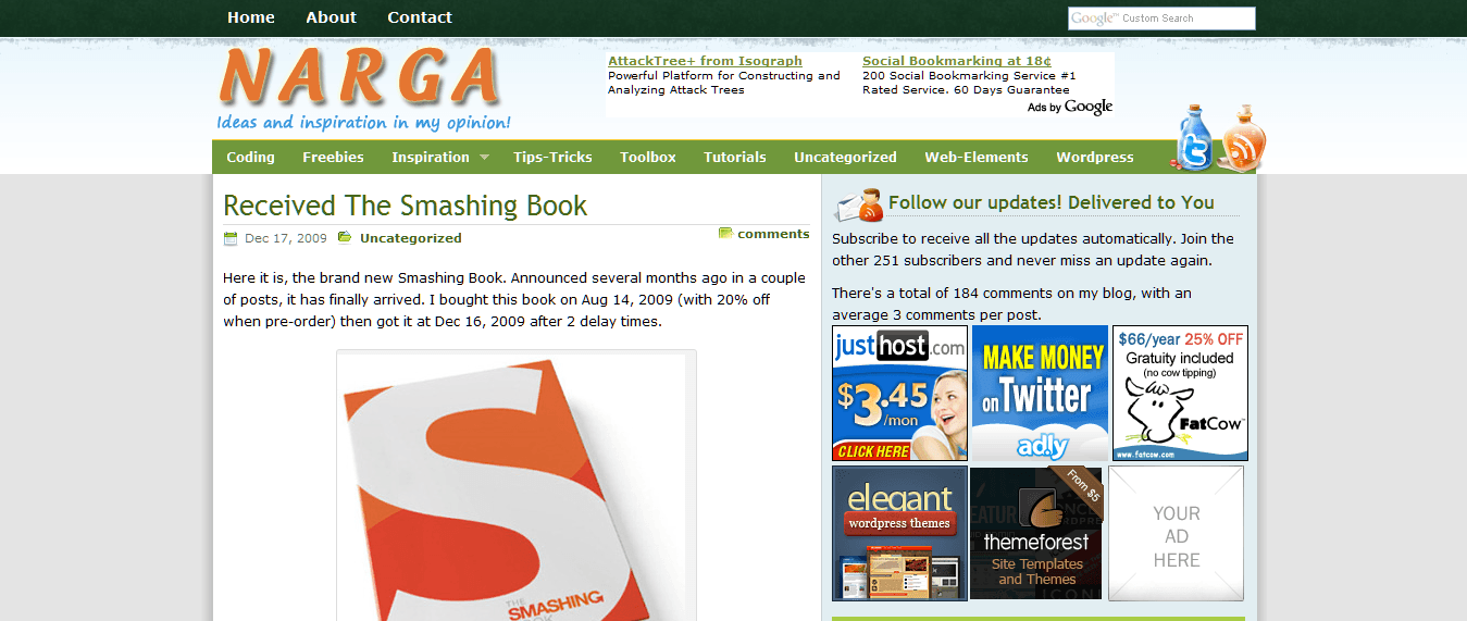
I’ve rolled out a new design for Narga since yesterday evening. You may have noticed that I haven’t updated the blog for last months now. This is first post of this year to let you know that I’m back.
What happened?
I’m not going to lie to you, the main reason I stopped creating tutorials, themes and plugins is because I wasn’t very motivated and didn’t have much time either. The last redesign was one years ago, used table layouts, a lot of image files, and as a result was really sluggish. It’s definitely not good when your site takes almost ten seconds to load and you’re marketing speedy web hosting.
I started new design on this in mid October, 2009, the layout changed many times in the first couple of weeks before I (mostly) settled on what you see now. Since then though I’ve rewritten the ‘theme’ behind this half a dozen times, still not sure I’m entirely happy with it, but its better than before.
Website redesigned features
With the new design I employed some grid-based design principles (I learned since the last redesign) which has made for a much more organized look and feel. If anything, the new design may be a bit too symmetric. For the navigation, we decided to add drop down menus to the tab items. I still have mixed feelings about drop down menus, but I do like them in this particular instance.
I’ve also taken a minimalist approach to design that uses lots of whitespace and gives priority to our main content with a wider post width and a larger font size (no more squinting on that high-resolution monitor). By cutting down on the amount of content on the homepage, I’ve reduced load times and made it easier to skim our headlines for the news and editorial you care about most. Some of the colors from the old design were kept and some new ones were introduced. The background is now grey as opposed to a dark green.

As far as particular features go, a new “featured posts” box sits next to the second post on the homepage and in the sidebar of every single post page. It’s intended to highlight some of the content you might otherwise overlook, with a tab for the most recent posts and another for those that garnered the most comments in the past few days. We’ve also started to measure the traffic to our individual posts more closely and will add a tab with the most popular posts as well.
The theme is version 6.5 with code name “Mecury” which are powered by WordPress, XHTML, CSS3, (yes CSS3 – why not eh? The CSS3 enhancements I’ve used are not compatible with all browsers, just the ones that are modern and standards-compliant. Only browsers has Gecko and Webkit layout engine just as Firefox, Safari, Orca, Chrome… has full support with CSS 3 now) and jQuery JavaScript Library.
I have used a number of API’s to pull content from other site:
- Google’s FeedBurner API for stats and RSS content deliver.
- Twitter updates are powered by the Twitter API’s using JSON Requests.
That’s not all. I’m planning on adding a portfolio section, but it’s not nearly ready to added just yet, its something I will work on later in the year.
How do you feel about new design?
I’ve been watching as the initial feedback has rolled in through Twitter and in the comments to our other posts. The web is permanently under construction and while I’m still making lots of small changes, I wanted to take a second to write a proper post explaining our intentions and soliciting your feedback. Before I get too far ahead of ourselves, let me know what you think in the comments below.