In recent years, Retina or HiDPI Display has been one of the most discussed topics among web designers and developers. With more and more high resolution devices are being introduced to the market every year, it has become quite crucial to get your WordPress site ready for retina displays.
Although as a response to the HiDPI display technology, many WordPress developers has come up with various retina display optimized themes and plug-ins, but still most of the website owners are constantly asking themselves these questions:
- What Does Retina Display Mean?
- Why Do Images Appear Blurry on Retina Displays?
- Why Do I Need to Optimize My WordPress Site For Retina Display?
- How Can I Make My WordPress Site Ready For Retina Display?
Through this blog post, not only you’ll get satisfactory answers to all these questions but also be able to make a WordPress site compatible to Retina display devices without any hassle.
Let’s begin!
What Does Retina Display Mean?
Retina Display is a brand name used by Apple for screens which have a high pixel density – around 300 or more pixels per inch (PPI) – that is imperceptible to the human eye at a normal viewing distance. The term “Retina Display” was first introduced in 2010 during the launch of iPhone 4, which featured a liquid crystal display of (960×640) pixels resolution with a pixel density of 326 PPI. In a Retina Display, you get everything double (in pixels) of its native size as compared to a traditional display of the same physical size, which is called HiDPI or 2X mode. That’s the reason why text, images and icons on iPad 2 appear blurrier than on iPad 3.
Why Do Images Appear Blurry on Retina Displays?
For example, let’s take an iPad and an old desktop monitor which have display of same size. Putting these two devices side by side, you can see everything looks clearer on the iPad than monitor. This happens because iPad has a higher pixel density than monitor. A typical monitor has a 72PPI pixel density while a Retina display has relatively much higher pixel density, 400PPI or higher. That’s why; a standard image that looks perfect on a standard monitor becomes blurry on a Retina display device.
Below are some other most common reasons why images get blurry on a Retina display:
- The Image you uploaded is already Blurry: It often happens when you upload an image, which was captured using a slow shutter speed, directly from your camera or phone to your WordPress site. The image may look fine on the screen of your mobile or camera device but when you upload it to web, it doesn’t look the way it should be. Instead, it appears frustratingly blurry.
- Browser Resizes Images Dynamically: If you’ve implemented responsive web design technique on your site, the browser using media queries will shrink and enlarge images to make them able to be viewed on smaller or larger screens. Unfortunately, shrinking or expanding done without any purpose can degrade the quality of your images.
- WordPress Resizes Image after Upload: If you force WordPress to resize images while uploading, you would not get them as sharp as original. Asking WordPress to upload correctly sized images not only creates multiple versions of an image but also leads to poor picture quality.
Why Do You Need to Optimize Your WordPress Site For Retina Display?
The answer to this question is quite simple: there are millions of people who use Apple devices to access the web. Therefore, it becomes quite crucial for you to ensure your WordPress site is looking great on those devices. Plus the industry trend, we all know about it: when Apple does something new, other companies try to do the same. Over the past few years, a lot of devices with similar retina capabilities have been introduced and there’s no doubt, we’ll be seeing a lot more such devices in near future. Needless to say, that day is not too far when Retina display will become a standard for developing websites.
Here are some solid reasons to optimize your WordPress site for retina display:
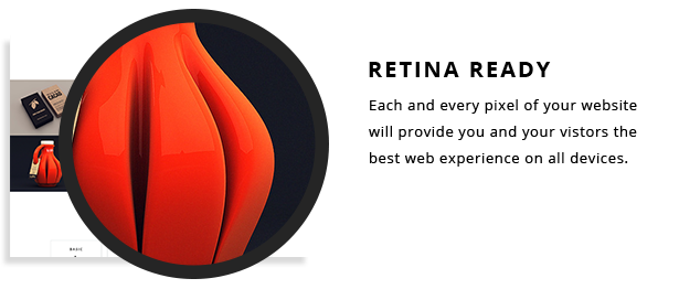
- Sharper Images and Brighter Colors: The main motive behind the use of retina display technology is to deliver users as sharper images as possible. As a retina ready device has a very high pixel density, users get extremely vivid and bright colors on retina ready devices. In essence, if your WordPress site is compatible to a retina display, it would surely look stunning on all kinds of HD and non-HD devices.
- Development with Subtle Details: Optimizing a website to take advantage of retina ready devices’ display capabilities is something that every developer should do. While making a site ready for retina devices, you as a developer come across various subtle details that you never see while developing a website for regular screens. Thus, developing for Retina devices proves to be quite helpful in improving your web development skills.
- Enhanced Visual Aesthetics: If your site is retina ready, your users would get better picture quality and sharper fonts on all devices. Unlike traditional displays, where fonts are unable to be stretched, retina displays keeps fonts smoother. Best of all, there are a number of fonts available, especially prepared to maintain their quality on retina devices while a user zoom in/out of a webpage.
- Over 200 Million Users Feel Your Site Is Ugly: If your site is not retina ready, your users are suffering right this moment. Believe it or not, over 200 million users now own retina-enabled Apple devices. When they visit your website on a retina device, they find its fonts tough to read and images blurry, grainy and pixelated. So if you think your audience uses devices loaded with the sharper screen feature, it’s time to get your site ready for retina.
How to Make a WordPress Site Ready For Retina Display?
Since version 3.5, WordPress has built-in Retina support for its admin panel. But being retina ready on the admin side doesn’t make all things right. To deliver users a better user experience, you need to be retina-friendly on the front side as well. Here are ways you can make your WordPress site retina ready:
- Using
Retina.jsScript:Retina.js, an open-source script, makes it quite easy to serve high-resolution images to retina ready devices. When a user loads a page on your site, it checks each image on that page to see whether a high-resolution variant of that image exists on your server or not. If a high-resolution version is available there, the script automatically swaps in that image in-place. All you need to upload two versions, standard and high resolution, of an image to your WordPress site, add@2x after the file name of high resolution version, andRetina.jswill handle everything for you.
For example, if you have an image on your site like this:<img src="http://yoursite.com/images/logo.png" alt="company" />
Then,
Retina.jswill check your server to see if there is a high-resolution version of this image available at this path:<img src="http://yoursite.com/images/[email protected]" alt="company" />
If the
logo@2x.png file exists, it’ll replacelogo.pngwith[email protected]for devices with retina display. - Using Plug-ins: In case you’re not interested in using Retina.js, you can take advantage of these WordPress plug-ins to make your website look crisp and beautiful on Retina displays:
- WP Retina 2x: WP Retina 2x plug-in automatically generates high-resolution image files from your uploaded images and serves them to Retina devices. You can choose from four different methods – Picturefill, Retina JS, IMG Rewrite and Retina-Images – to serve retina images to your visitors.
- Retina Image Support: This plug-in allows you to easily add retina image support to your WordPress site. It simply adds the above mentioned retina.js script to your WordPress powered site and therefore, you would need to upload images with the @2x name.
- Icon Fonts: Now you might be thinking “should I double the size of all my icons?” No, you don’t need to do that. Thankfully, retina devices can read @font-face embeds and therefore, you’re welcome to utilize font icons instead of images. Icon fonts are awesome in terms of scaling and browser support: not only they scale to different screen sizes and resolutions but also are supported by most of the mobile and desktop browsers. Some of the popular icon font solutions that you can use are Font Awesome, IcoMoon and Fontello.

That’s it! You would definitely like to share your thoughts on following questions through the comment section.
What do you think about the future of Retina display devices?
Is there any other plug-in to make a WordPress site Retina compatible?
Does anyone else make devices with similar retina capabilities?