Your conversion plays the biggest role in the success of everything you do online to generate revenue. Basically, the player with the highest conversion rate wins, since they’re getting more out of their marketing dollars at a less expensive rate per acquisition for a new customer, .
There are a few clever ways, however, to subtly tweak your website in order to boost your conversion rate to gain more customers for less money. Consider the following 10 ways to modify your site to increase your website conversion rates and enjoy more sales overall.
1. Make what you’re offering very clear.
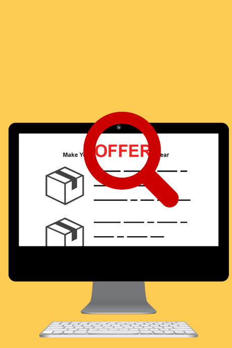
Understanding the value proposition of your business is extremely important in terms of providing value for your clients. In fact, it has the potential to transform your entire business and simplify both the communication and sales process regarding your prospective clients and current customer base.
The value proposition of your business is one of the main reasons why people trust and choose to buy what you’re offering. You drastically improve your whole marketing and sales funnel when you convey a successful value proposition. The following questions may help you in developing your key value proposition:
- What can you do better than any of your industry’s competitors?
- What is your brand?
- How do you want people to view your brand and be known for?
Your customer are the best source of information to answer the above questions. Talk to your customers, ask them about their motivations, what do they consider in their decision making process? Why didn’t they choose other service providers?
Furthermore, Your business should have multiple value propositions. Firstly, you need a value proposition that encompasses your business. Secondly, each of your services offering also need a clear value proposition. Because, you need to articulate why your business is better in your market place, and why the particular product your prospect is interested in is also better than your competitors.
2. Simple is better.
As humans we generally don’t like anything we view as too complicated. This applies to website design and structure as well. Therefore, it’s crucial that you simplify your site and its pages so you can enjoy the benefit of higher conversion rates and therefore turn more visitors into customers. It’s all about simplicity and relevancy.
As people we tend to think simplicity is attractive. Therefore, websites that are deemed visually complicated are thought to be less attractive since they’re visually straining and make the brain work harder in an effort to properly interpret and understand the given information and eventually come to a decision.
The ideal website has a simple navigational process and easy-to-understand internal page layout structure. There should be an obvious, logical, consistent order and natural progression of the information you wish your visitors to read and act upon.
3. Guide your visitor to your call-to-action.
Generally speaking, when you want a visitor to click and complete a desired action on your site such as; a form button or add to cart button. The bigger the button and the closer the proximity it is to where the expected location of the visitors mouse is, the higher the chance you have of getting the outcome you want.
A call-to-action button should easily stand out from everything around it in terms of appearance, the colour should be contrasting everything around it in most cases. Its contrasting call to action also draws your visitor’s attention and serves as a visual indicator for what they should click on next.
Another key area where a lot of my clients make mistakes regarding their call-to-actions is that they don’t have any true value behind them. In other words, if you want your visitors to sign up for a free webinar or email opt-in, they need to know about the value that they’re going to receive in return. Why should they fill in your form? What type and to what degree of value will they get from engaging in this non financial transaction?
Overall, call-to-actions work when they’re crystal clear and not competing with other nearby call-to-actions. Essentially, you should have only one call-to-action per page.
4. Prove what you’re claiming.
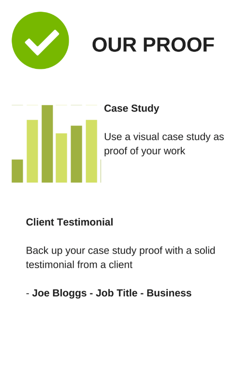
If your site lacks real proof and credibility in any way, you will fail miserably in authenticating everything you’re claiming is true. In fact, even the tiniest bit of insincerity or anxiety can potentially chase your visitor away in a heartbeat, resulting in a lost sale.
Consider this: All the visitors to your site are flooded with almost 700 advertisements each and every day, which makes them a master in scepticism. Therefore, they’ve developed both a subconscious and conscious built-in spam filter that works to block out literally hundreds of advertisements each day. As a result, it’s your job to get them to read, understand, and believe your content in order to act upon what you have to offer.
Here are a few key ways to increase your credibility in the eyes of your visitors:
- Provide examples and credible documentation: Use various examples and convincing documentation whenever you make a certain claim in order to support your idea.
- Be specific: Always be very specific when it comes to marketing communication. It will help build confidence and trust in what you’re trying to convey to your audience.
- List your media publications: Show where you’ve been featured. Have you ever been on TV or featured in a newspaper, magazine, or other forms of media that could possibly help boost your positioning and general credibility?
- Give reasons why someone should choose you: Conveying to people how your product can benefit them and how it’s more valuable than your competitors will likely resonate with your potential customer on a deep emotional level and increase the chance of them buying from you.
- Brag about your success:Does your product or service have an outstanding track record of always delivering on what it claims? If necessary, reveal the statistics on just how well your product works.
- Add testimonials to your site:Getting satisfied customers to speak on your behalf is an excellent way for potential buyers to see your product or service through the eyes of others as well as proof that is works.
- Provide a guarantee:Today, many business owners underestimate the power of providing a guarantee, which is probably one of the best ways to build credibility for your brand and products. And, it also mitigates the perceived risk of the visitor doing business with you.
- Get celebrity endorsements if possible:Can you get any celebrities to help endorse your service or product? Keep in mind it’s not necessary that they’re wildly famous or a mainstream celebrity in order to be an actual celebrity. They just need to be perceived as a celebrity to your particular market.
5. The importance of a good headline.
A headline has a very important role to play. It needs to entice your visitors to engage with your content, enhance their desire for your product or service, and help inspire them to click on your call-to-action. Almost every page on your site should ideally have its own headline. The headline should in most cases capture the value proposition associated with that page.
Most people don’t spend enough time brainstorming and tweaking their headlines. because, if your headline doesn’t capture the interest of your audience, people won’t continue to read your content. You should write as many as 30 – 50 headline variations or more and then choose the best fit for that particular page.
6. Why you’re landing page and traffic must be relevant.
Relevancy between your landing page and where you’re getting traffic is often understated. It’s crucial to have congruency between your destination page and the predisposed ideas your traffic has before coming to the page. For example, if you’re the owner of a building company, but you specialise in renovation and not new homes. Having ads on Google’s search network for “new home builder” related keywords when you have no information your site about building “new homes”, is incongruent. This is a simple example. But, I see all the time clients having an incongruent relationship between their ad copy and the landing page they are sending traffic too.
7. Decrease friction on your website.
Friction on a website is a notorious conversion killer. Basically, your site needs to be logical, easy to navigate, and very simple in order to encourage the maximum amount of people to complete your desired action.
Here are some of the most common types of friction on a website:
- Confusing eye path. Meaning, that people have look everywhere to get all the information on the page.
- Forms that demand too much information
- Too many calls-to-action per page
- Confusing checkout process
- Redundant form fields or steps to follow
- Lengthy pages
8. Make your website mobile-friendly.
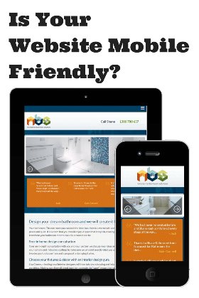
Your website traffic will grow considerably if it works on a variety of mobile devices. If not, you’re leaving a great deal of money on the table.
Here are a few things you need to consider when viewing your website on the screen of a mobile device:
- If your website generates a substantial number of calls, be sure that the phone number on your site is prominently positioned on your mobile site, as you don’t want to make it hard for people to contact you.
- Make sure your number is clickable.
- Incorporate call tracking.
- Eliminate all rotating banners.
- Make the navigation process very simple, with a maximum of two levels deep overall.
- Prioritize your data according to importance.
- Reading is sometimes a source of friction. Therefore, video and images can also be a valuable way to convey your message on a mobile device.
- Implement content tabs that can easily expand in order to avoid too much scrolling.
9. Long copy or short copy?
Many business owners and online marketers claim that short copy is the way to go online. However, this is right and wrong at the same time.
Ideally, your copy should be short enough to communicate a clear message that can easily answer at least these basic three questions:
- Where: Because people consistently jump from one page to the next while navigating through countless web pages, they need to know exactly where they are to avoid confusion. Confused visitors tend to quickly push backspace buttons.
- What:What is this site or page about? Avoid confusion by using clear headlines, subtitles, opening paragraphs, and bullet points. What can they do or get from your website or business?
- Why: The why part is fundamentally a value proposition based question.
Why should your most ideal customer choose to do business with you opposed to a competitor or doing nothing?
- What does your brand specifically do for your ideal target audience?
- What does your ideal prospect need from you? What do they constantly worry about? What keeps them awake at night?
- What kind of benefit will your ideal customer get as a result of accepting your offer?
10. Beauty talks, while ugly walks.
maybe you think because a web developer is using a free open source platform like WordPress, you should just go ahead and create your own site. Seriously, don’t do it, it will cost you 10’s or even 100’s of thousands of dollars in lost sales.
Expert website designers spend endless hours perfecting their craft. The livelihood of your business is at stake and you need a website that shows “you’re a professional business”, not a poorly designed, haphazard site. With an amateur-looking site, you run the risk of potentially losing tens of thousands of good-paying customers. A lot of credibility and perceived value comes from world class web design
Overall, an effective and powerful website is a combination of many key aspects that contribute to its success, rather than any one thing. For that very reason, in terms of good business, it pays to focus on what really matters so you can maximize your potential for success. And a good website really matters.
Excellent article. Another point thats worth thinking about and is often overlooked is design layout. Its natural for us to read from left to right, and top to bottom. So any calls-to-action, signup forms etc seem to convert better when right-aligned on a page. For local business websites, its always more beneficial to have a contact phone number predominantly displayed across the top right next to the company logo.
Make the web fast load. It can reduce bounce rate.