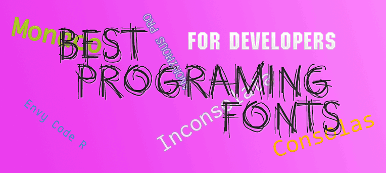
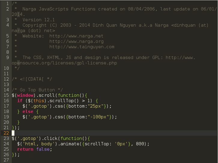
Are you a programmer? If yes, you had 3 questions with coding tools. What’s best text editor (IDE)? What’s best programming font? What’s best code color scheme? I got them like you and I spent more than 1 years to choose and using Monaco as programing font but I’m still looking for better programing font than Monaco
I’m using VIM as my default code editor, thankfully, I don’t take too much time to pick it. I felt in love with VIM after tried Emacs, GEdit, NetBean, Eclipse … but the next step to choose a good font that takes too much time than I expected.
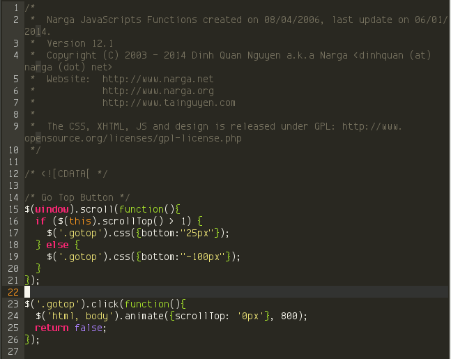
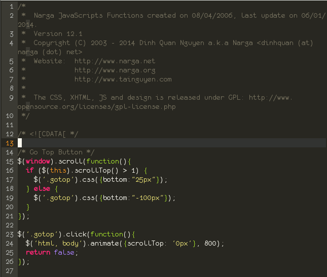
Here is a list of my favorite programming fonts that I have tested. I’ve used Linux for 7 years, I take screenshot of each font in VIM with Full of Anti-aliasing. So I can’t really say anything about how these fonts look on Windows or Mac OS, let’s test by yourself but I guess it’s the same.
Programing Fonts Requirement
Most variable-width fonts are not suited for code because programming fonts have different requirements than text fonts. Here are some of the things I’m looking for in a font for coding:
[digitalocean]
- Monospaced assignment operators nicely line up and make aligning code easier. Coding is easiest for most developers when using a fixed-width font.
- Clear and highly readable: The font that I’m looking for must has clear letters, with easily distinguishable punctuation and between certain common characters like zero and O character, 1 and l and | … The font should be easily legible at any size, and in particular at small sizes.
- Unicode to display almost characters with any languages
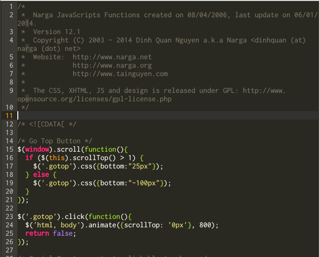
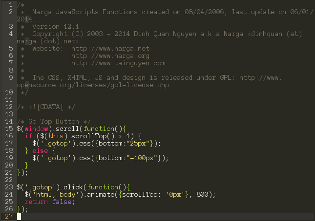
1. Monaco, Regular, 10pt
This font is my default font. It’s excellent font, originally from the Mac. Monaco shines for legibility at non-antialiased small sizes, when you really want to maximize your on-screen code. This font looks great at 9 or 10-points.
2. Consolas, Regular, 11pt
Consolas is specifically designed to work with ClearType, so may become highly aliased when ClearType is not turned on. Consolas is a commercial font, but is bundled with many Microsoft products, so there’s a good chance you might already have it to use on Mac, Linux. It comes with the newer Windows and it’s a VERY high quality font.
3. Inconsolata, Medium, 12pt
It seems fuzzier than necessary and some letters end up with a nib below them. Inconsolata is designed to be used with anti-aliasing enabled, but it’s surprisingly legible even at very small sizes.
4. Anonymous Pro, Regular, 11pt
Anonymous Pro (2009) is a family of four fixed-width fonts designed with coding in mind. Anonymous Pro features an international, Unicode-based character set, with support for most Western and Central European Latin-based languages, plus Greek and Cyrillic.
There are two versions: Anonymous Pro and Anonymous Pro Minus. Anonymous Pro contains embedded bitmaps for smaller sizes, Anonymous Pro Minus does not.
5. DejaVu Sans Mono, Book, 10pt
This nice open source font family is derived from the Bitstream Vera family, itself close to the Microsoft core Web fonts. Its purpose is to provide a wider range of characters while maintaining the original look and feel through the process of collaborative development.
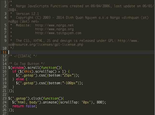
6. Terminus, Regular, 12pt
Terminus Font is a clean, fixed width bitmap font, designed for long (8 and more hours per day) work with computers, remember to turn off aliasing. Terminus is the closest thing to 6×13 fixed that comes pre-packaged on modern Linux distributions.
7. Source Code Pro, Light, 10pt
Source Code Pro is a set of OpenType fonts that have been designed to work well in user interface (UI) environments. An open source programming font released by Adobe, made with the intent of maximizing usability and avoiding common design flaws in monospaced fonts.
8. Bitstream Vera Sans Mono, Roman, 11pt
It has a fully-serifed i and excellent numerals, and a lowercase. The Bitstream Vera Sans Mono typeface in particular is suitable for technical work, as it clearly distinguishes ‘l’ (lowercase L) from ‘1’ (one) and ‘I’ (uppercase i), and ‘0’ (zero) from ‘O’. I’m using it as default font of Arch Linux.
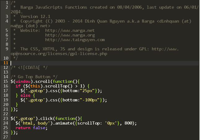
9. Envy Code R, Regular, 10pt
This typeface contains over 550 glyphs providing full complements for DOS, Windows and Mac versions of the US, Western, Central Europe, Turkish, Baltic, Icelandic and Nordic code-pages. This hits several Unicode ranges including Basic Latin, Latin-1 Supplement, Latin Extended A & B, Box Drawing, Block Elements, Letterlike Symbols, Number Forms, Arrows…
This font offers well distinct programming characters like {} vs. () and the classically confusing 0O and 1lI. Quite narrow (like Anonymous Pro) but squarish, the letters are easy to read and offer a pleasing reading experience.
10. Monofur, Regular, 13pt
monofur is a monospaced font (all characters have the same width) derived from the eurofurence typeface family. It shares the same style characteristics, but the proportions of most characters have been recalculated to fit into a 1:2 character cell. It’s one of the more quirky fonts among those favored by programmers (for things like its unique “e” and “g”).
Conclusion
You won’t find the best programing fonts that is suitable for every developers because choice of programming font is as much a personal preference as anything else.
Of course there are many more fonts out there but as mentioned above, they are my favorite programing font that I’ve tested with VIM. All the fonts discussed here are good choices for programmers, so use whichever font appeals to you.
Have I listed or missed your programming font of choice? If you have a favorite font, let me know, I really would like to know which fonts you are prefer. All comments welcome!
Nice list, thanks for sharing.
My current favourite monospaced font is Inconsolata.
Hi,
May I recommend our fonts site script. It allows you to create your own fonts site like 1001freefonts.com. You can view it at https://mfscripts.com/font-site-script/overview.html
Kind regards,
MFScripts
This post content about the font for programmer, not for create a listed fonts websites
the point of this post is completely lost because subpixel rendering is turned off on ALL of your pictures and moreover some kind of post processing was applied (even if by application you used for presentation – which to me looks like Atom’s ugliness..) because Terminus is a bitmap font and you can clearly see there’s something like “attempt to make it smooth” (which of course is total nonsense for bitmap fonts)
can’t see ringing artifacts, so there’s a chance you actually saved these screenshots in some lossless format like png and not jpg, but there’s a huge chance on the other side you’re scaling them for viewing purposes (which is utterly stupid) to make your web 3.0 awareness shine..
I wish your coding examples had used an IDE that shows some text in boldface. Mine uses boldface for static variables. If you had done so, it would have been clear that an otherwise excellent font like monofur doesn’t support boldface.
Also, my first criteria for a programming font is that that I can easily distinguish a zero from a capital O, and a lower case L from a one, a capital I, and a vertical bar. With some of your fonts, like Terminus, it’s very easy to confuse an l with a 1.
I had the problem as you said about some similar charater glyphs and I’ve mentioned at the beginning of this topic, I’m using Monaco font to avoid it.
Nice post! By the way, I find really nice the Mononoki font + Monokai color scheme.
nice post, I am using inconsolata 12 pt now.
By the way, I changed the terminal font often.
On linux mint 17.3 xfce only had one, DejaVu Sans Mono, out of your top 10 list.
It’s included in your distro and most common Linux ditros so it’s not include here :)
What about Input Font? What can you say about that?
http://input.fontbureau.com
Analize here:
https://www.slant.co/topics/67/viewpoints/56/~best-programming-fonts~input
But I want to hear what you think about Input.
thanks
Let’s me test it then I will update this comment with the review.